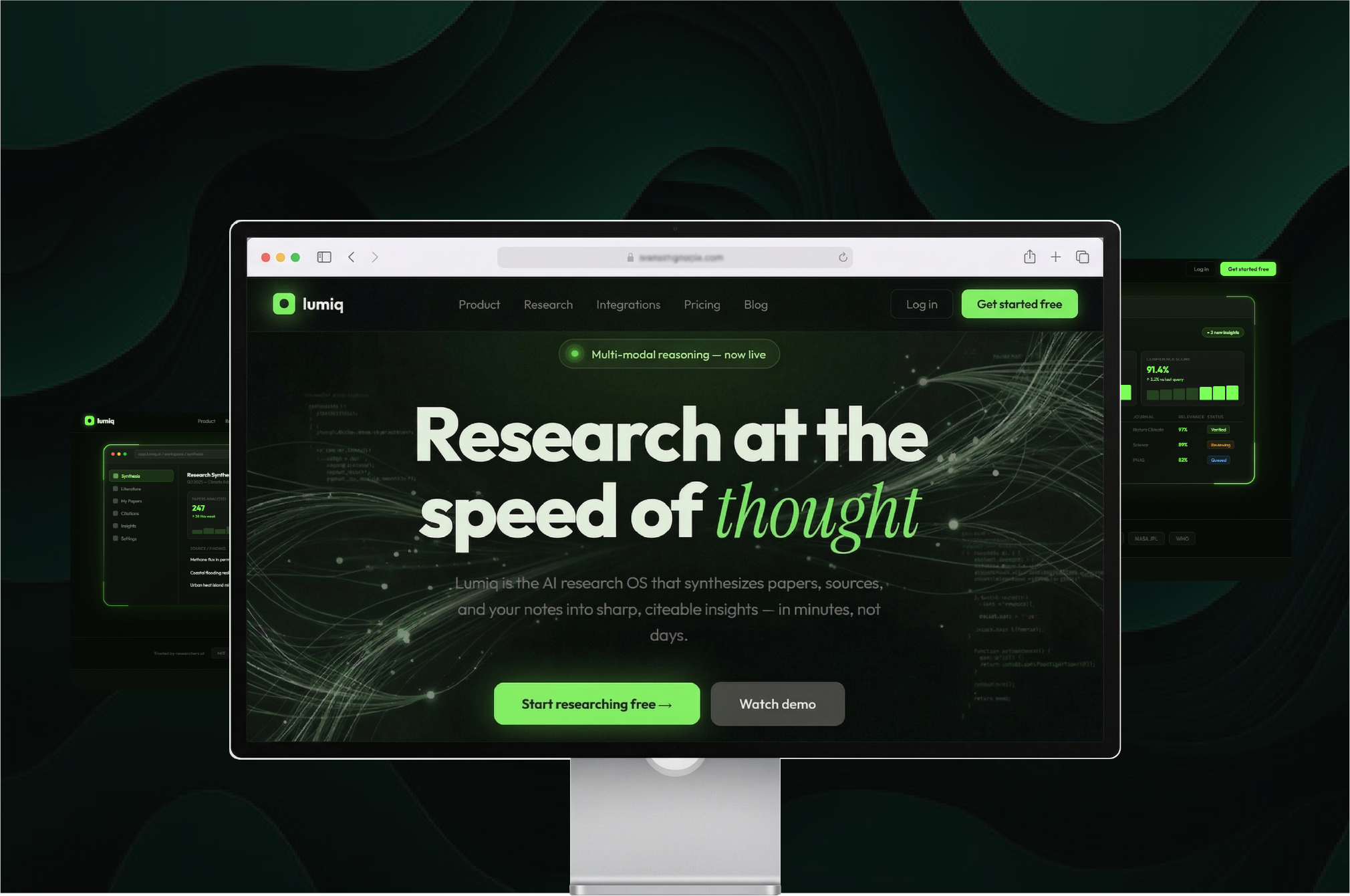
"Researchers spend weeks reading hundreds of studies. Lumiq synthesises them in minutes. The design had to communicate speed, accuracy, and authority instantly."
The Brief
Design a landing page for an AI research OS targeting universities and enterprise research teams, without looking like every other dark SaaS.
The audience was researchers at MIT, Stanford, Oxford, DeepMind. Design had to earn their trust before they read a word. I repositioned Lumiq not as "AI for research" but as "the Research OS."
Brand Positioning
Repositioned Lumiq from "AI for research" to "the Research OS", a systems-level infrastructure tool, not a feature.
Visual Design Direction
Dark UI, single precision-green accent, realistic product dashboard as hero image. Typography conveying academic authority without institutional stiffness.
Copy + Conversion
"Research at the speed of thought." Structured the page to move researchers from scepticism to action in one scroll.
The Trade-offs
Podcast-first layout over article-first
Audio was the core behaviour, the UI had to reflect that immediately, even though text-based CE was more familiar to the target audience.
Credit progress always visible
Surfacing CE credit progress at all times added visual complexity, but testing showed it was the #1 motivation driver, removing it hurt session length.
Simplified onboarding over comprehensive setup
Reducing the onboarding from 8 steps to 3 dropped completion rates from 60% to 95%, despite capturing less initial preference data.
"The page had to explain the software clearly and look smart, modern, and trustworthy. It had to do all three at once."
— Lumiq AI, Design Brief
What I Learned
Trust is the first conversion. For B2B AI, design says "we belong in your world" before copy says anything.
Show, don't describe. A realistic product dashboard as hero removed 200 words of product explanation.