"Khao Dil Se, Gully Style., The unapologetic, chaotic, fiercely delicious street-food culture of India, bottled into a brand."
The Brief
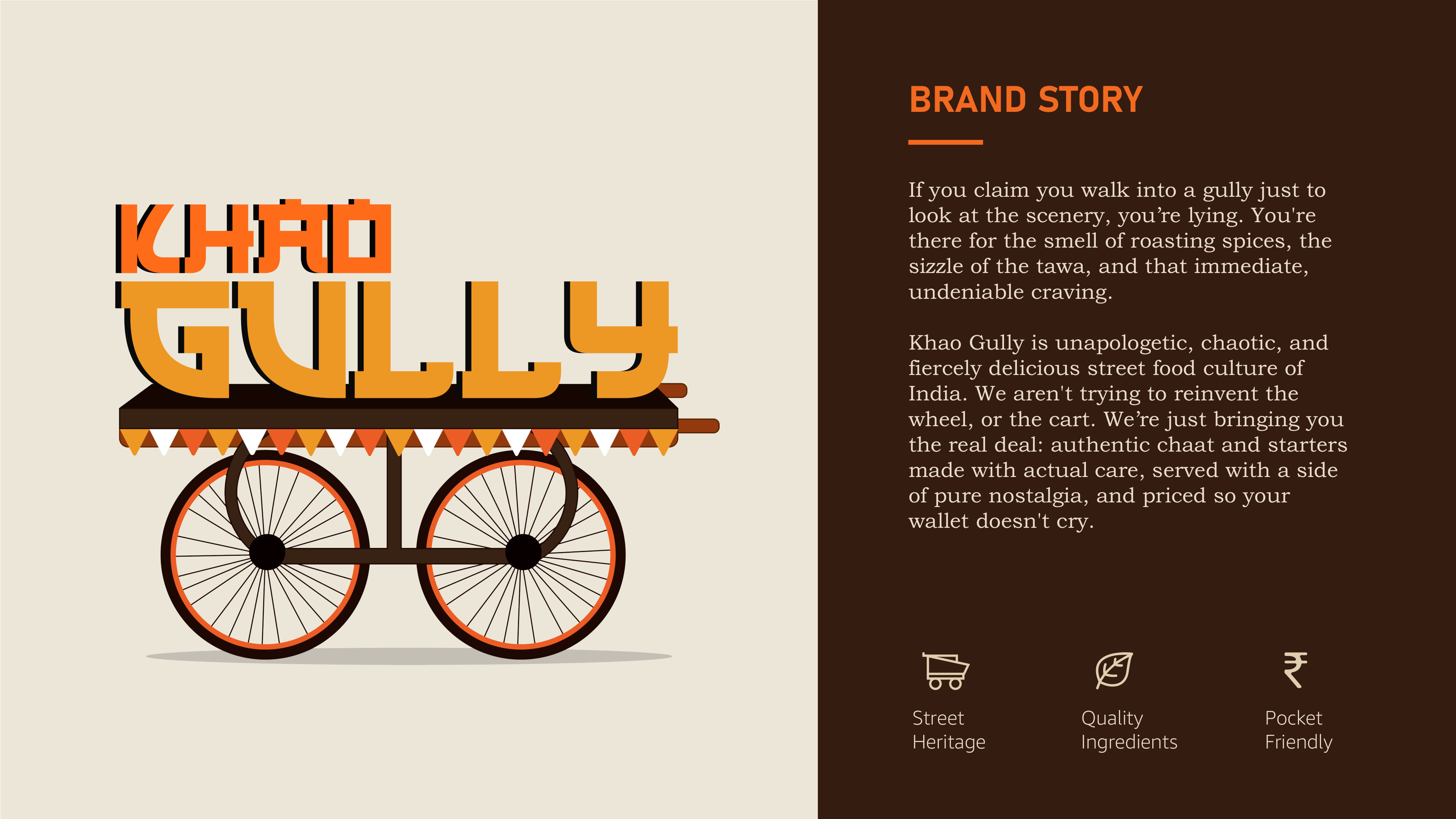
India's street-food scene is the most competitive culinary arena on earth, every corner has a local legend. The problem: stand out in a crowd without sanding off the raw, human energy that makes street food street food.
Built around three pillars, Street Heritage, Quality Ingredients, Pocket-Friendly, the brand had to feel hand-crafted and deliberately imperfect, because street food is not sterile.
Embrace the Madness
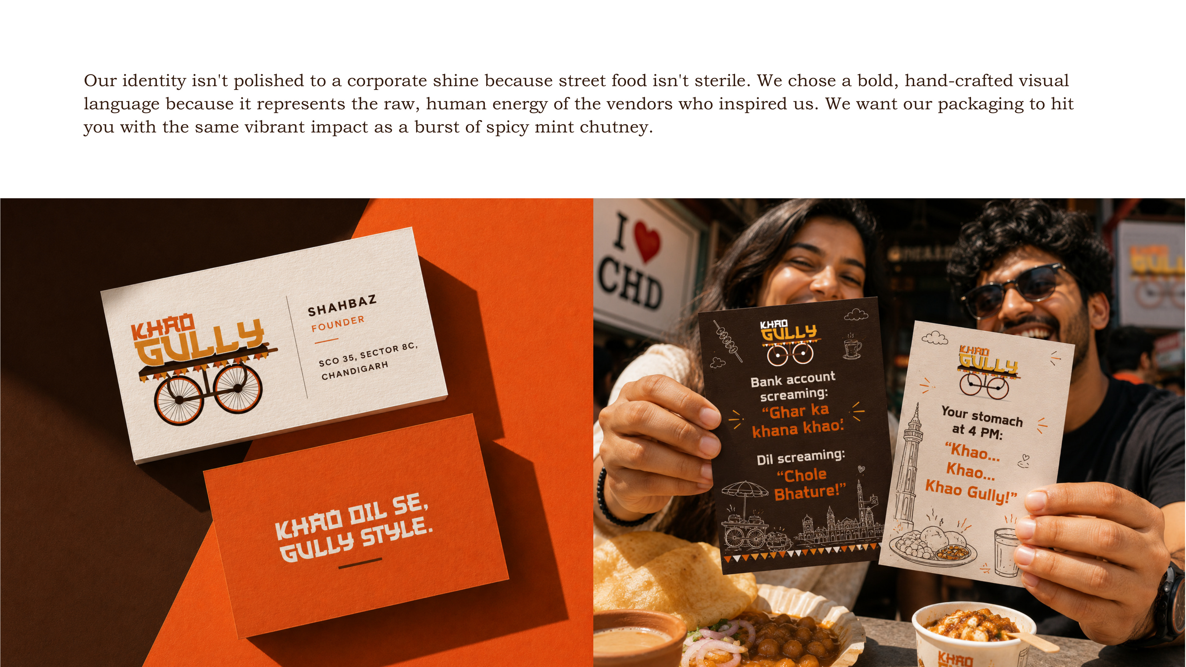
A bold, hand-crafted visual language, deliberately not polished to a corporate shine. The identity celebrates the chaos of the gully rather than sanitising it.
Three Brand Pillars
Street Heritage, Quality Ingredients, Pocket-Friendly. Every design decision mapped back to one of these, keeping the system coherent as it scaled across touchpoints.
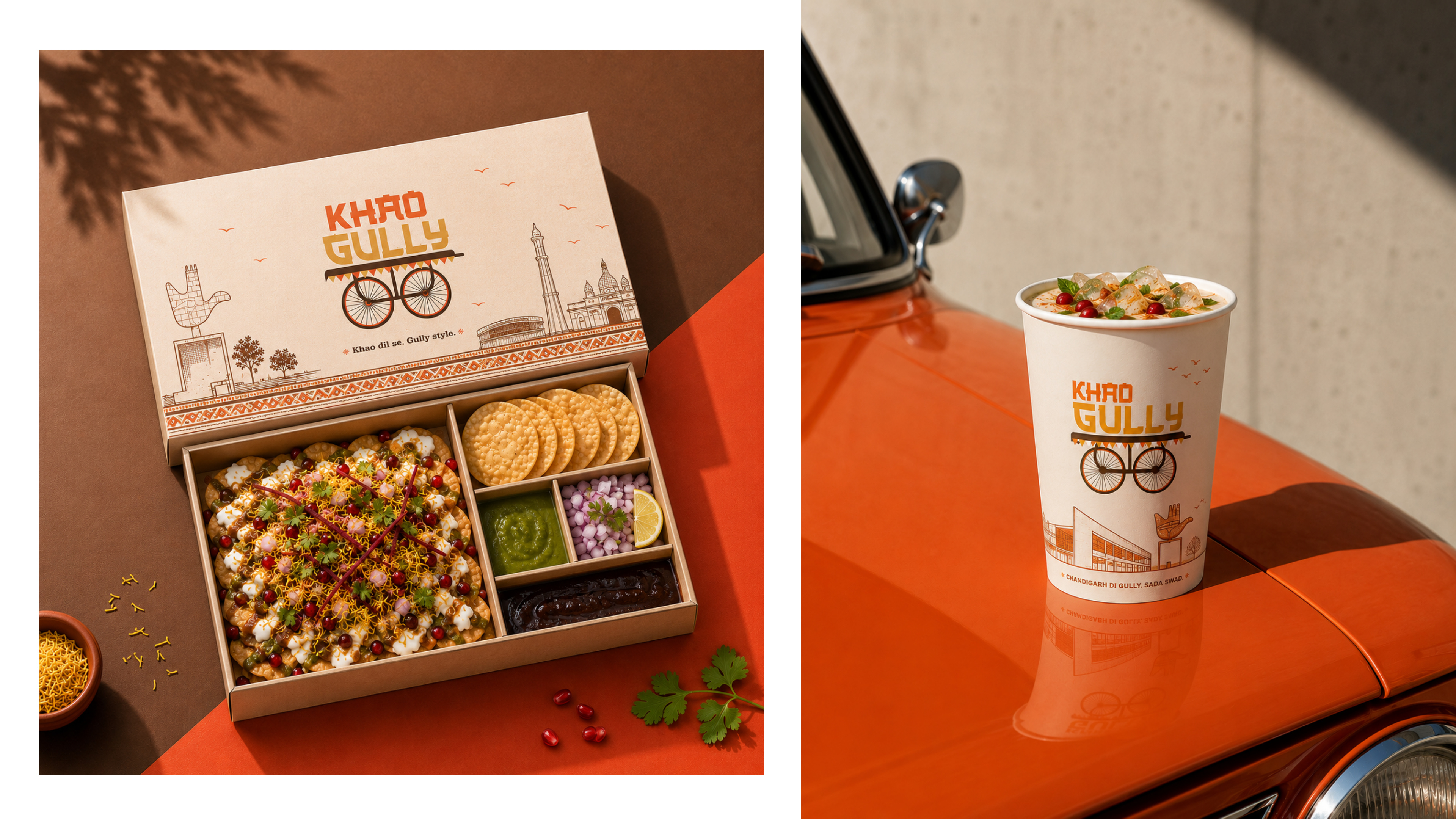
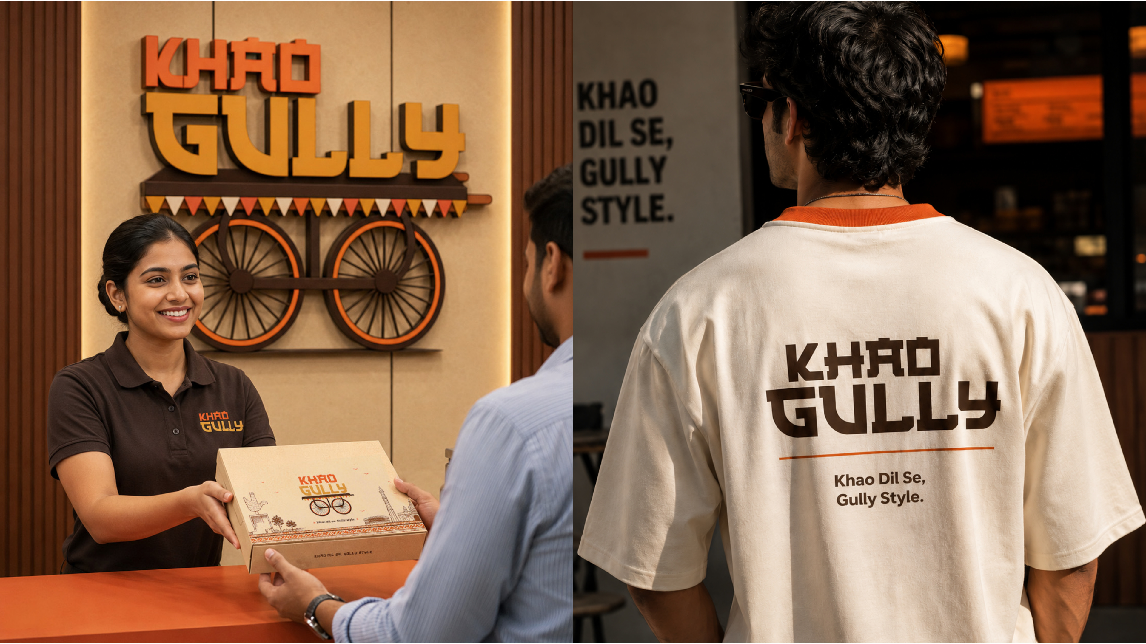
Packaging as the Hit of Chutney
Takeaway boxes, beverage cups, business cards, apparel, and signage, every touchpoint designed to land with the same vibrant impact as a burst of spicy mint chutney.
The Trade-offs
Hand-crafted rawness over polished corporate finish
Street food derives its soul from imperfection, vendor stalls, hand-painted signs, scrawled menus. Leaning into that aesthetic felt risky for a new brand, but ultimately made it the most memorable food identity in its category.
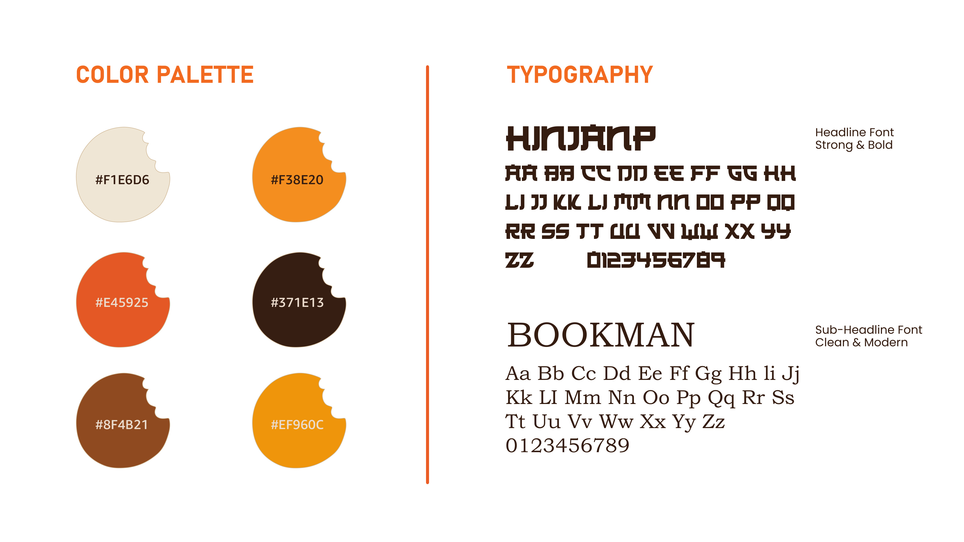
Six-colour palette over a simple two-colour system
A richer palette risks inconsistency across print vendors, but a two-colour system felt too sanitised for the brand. Solved by assigning strict hierarchy: saffron-orange as primary, dark brown as grounding, the four others as accent-only.
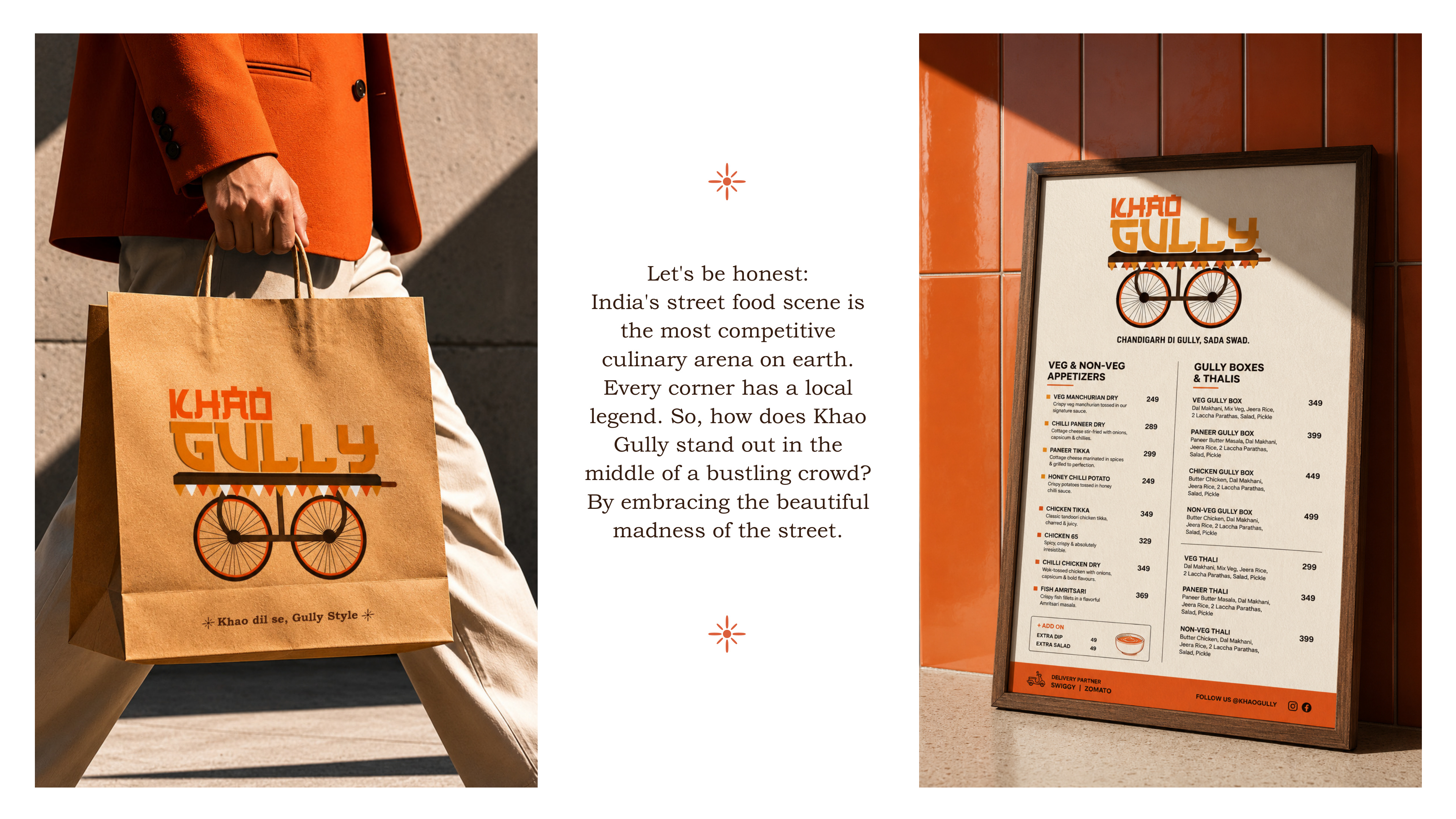
Packaging as the primary media buy
No traditional ad spend in the launch phase. Every rupee went into packaging quality, because the takeaway box travels, every person who holds it becomes a micro-media placement. High unit cost, but high earned reach.
"Packaging as the hit of chutney, every touchpoint landing with the same vibrant impact as a burst of spicy mint chutney."
— Abhinav Kaushal, Creative Brief
What I Learned
Cultural specificity is a competitive advantage. Leaning into the gully identity rather than sanitising it is exactly what makes this brand impossible to confuse with any other food brand.
Packaging is the brand's first communication. The takeaway box travels. Every person who holds it is a micro-media placement.