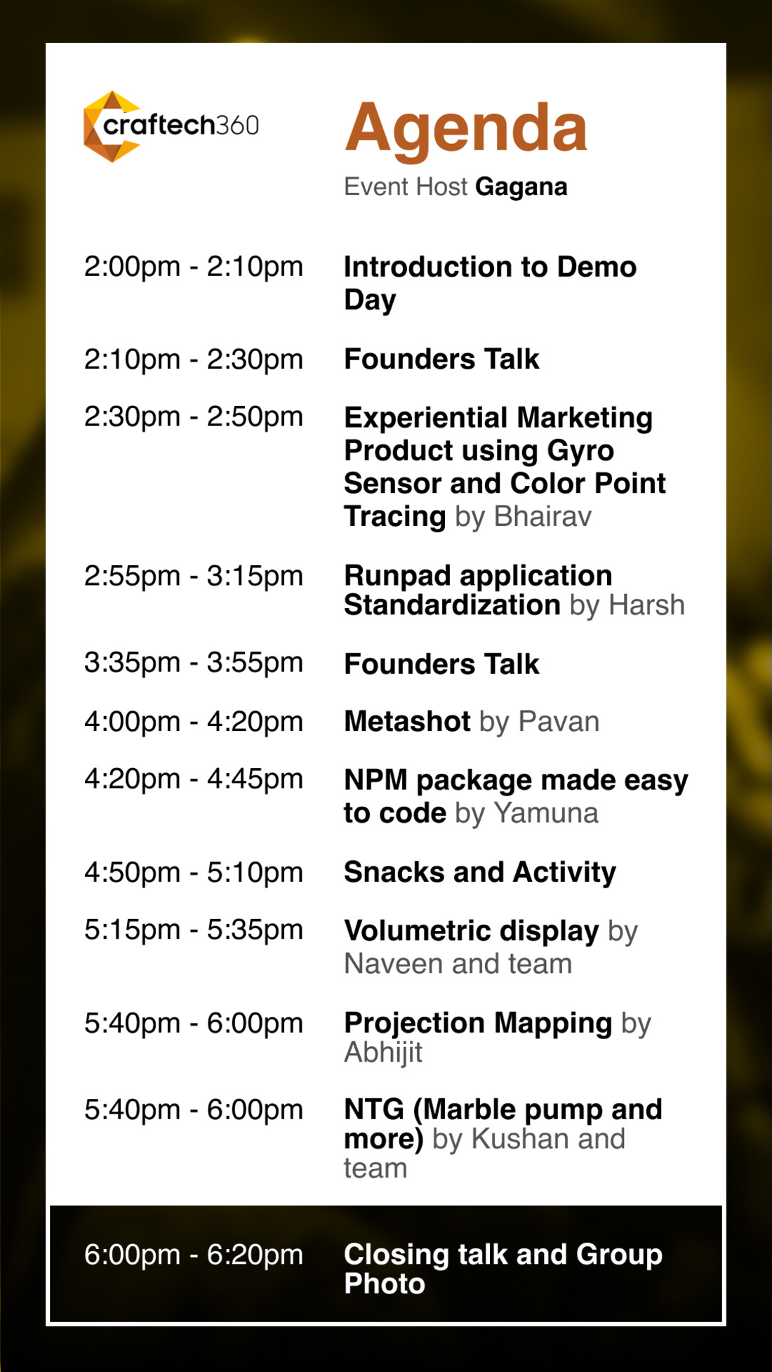
"Built the visual identity of an experiential technology powerhouse from a blank page. In two weeks. Industrial. Future-ready. Uncompromising."
One bold system,
built to scale
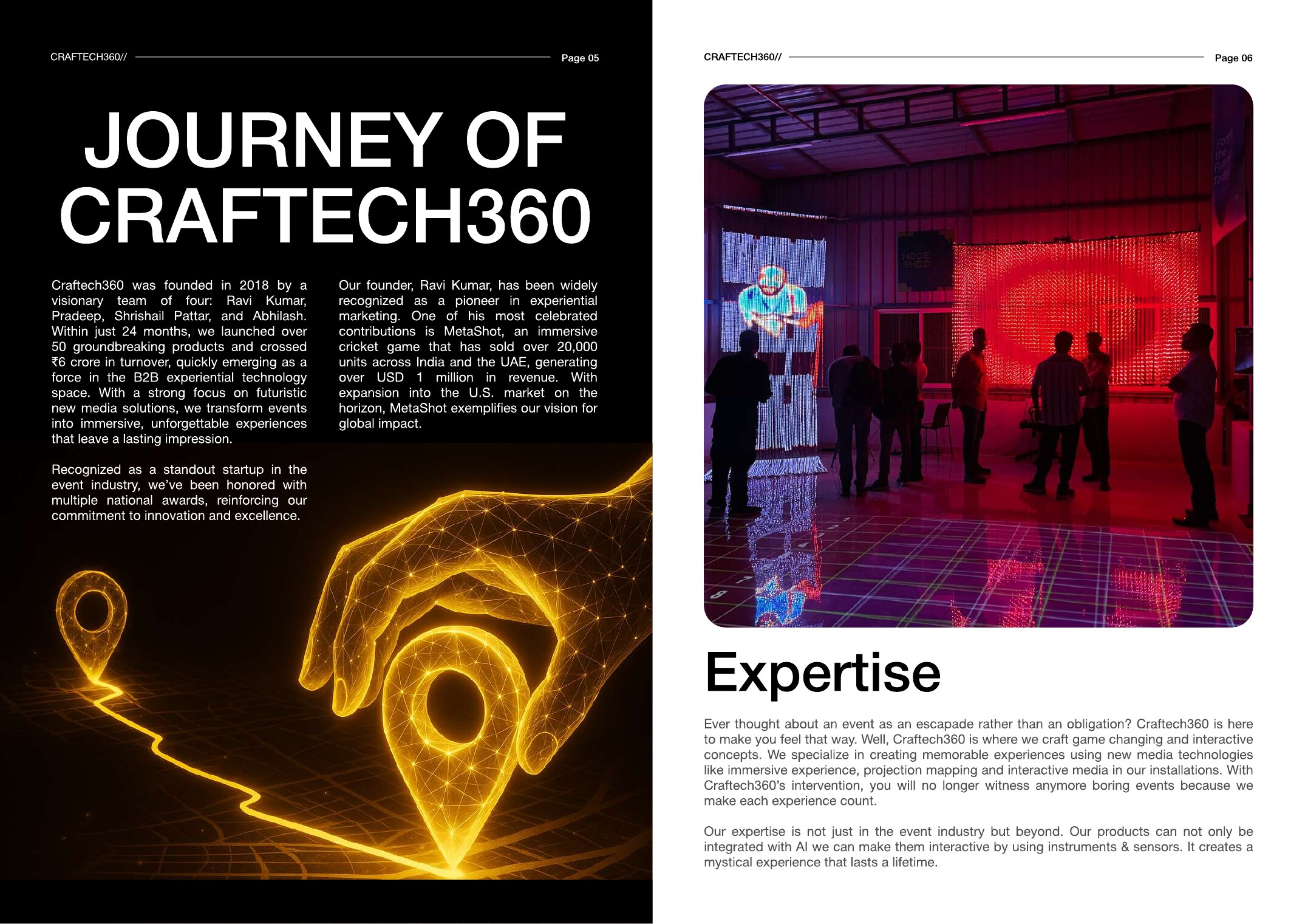
Founded in 2018, Craftech360 grew fast: 50+ products and ₹6Cr in turnover inside 24 months. Yet every deck, booth and post looked like it came from a different company.
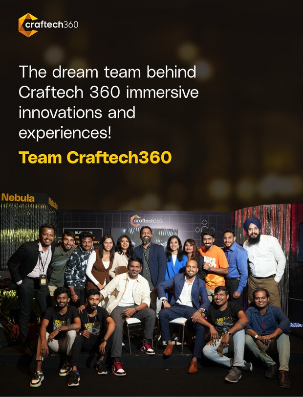
As Creative Alchemist I owned the brand from strategy through execution. I defined the core idea, codified a 75-page system, then proved it in the field across a product showcase app, two editions of WOW Awards Asia, an always-on social engine, and a full suite of print and sales collateral.
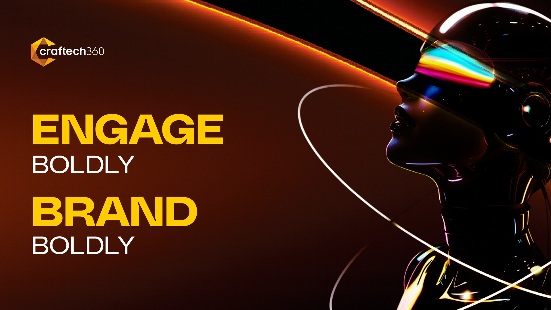
The Canted "C"
Every strong identity needs one irreducible idea. Ours is a single angular letterform that carries the entire system.

The brand language begins with the canted "C", a faceted letterform caught mid-rotation. It is angular, dynamic and always in motion, the visual shorthand for work that is immersive, interactive and innovative.
"The canted C is more than a mark. It is a symbol of creativity and forward momentum that defines everything we craft."
From that one form everything cascades. The faceted geometry becomes the pattern library, the molten yellow-to-copper gradient becomes the palette, and "always in motion" becomes the rule for how the brand behaves in space, on screen and in print.
The Foundation
The non-negotiables: logo, colour, type, pattern and voice, documented so any team, anywhere, ships on brand.
 Primary wordmark Dark Brand mark Isolated
 A molten gradient anchored on black. Vibrant tones over strong neutrals so content stands out with clarity and impact across every surface.
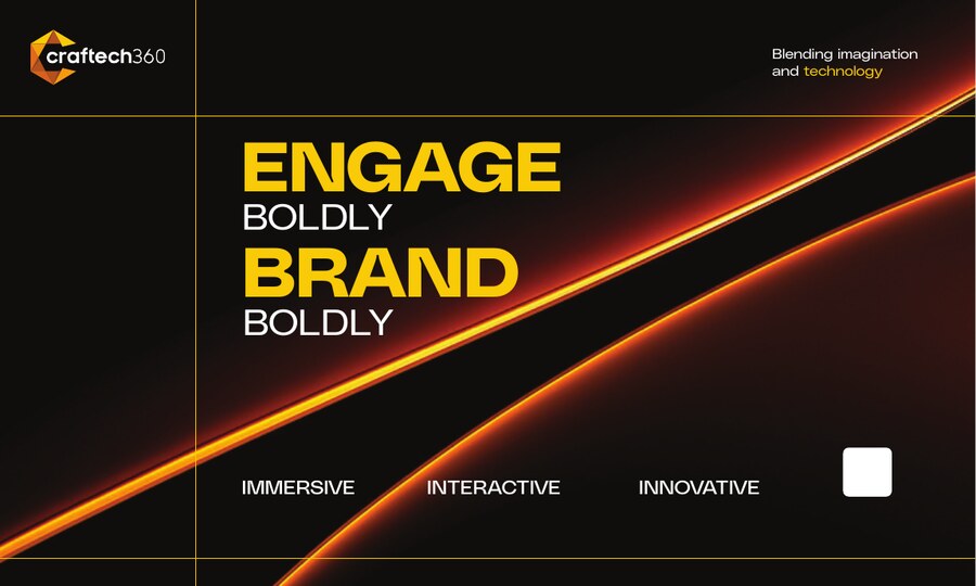
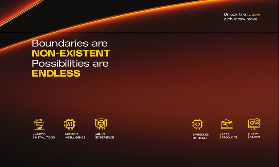
Boundaries are nonexistent.
Possibilities are endless.
The voice is confident and forward-leaning. It engages boldly and brands boldly, matching the ambition of the experiences Craftech360 builds.
One brand,
six technologies
The identity had to flex across radically different products, from a line of code to a three-storey kinetic wall, without ever losing itself.
Artificial Intelligence
Personalization engines, face recognition check-in, AI photobooths and chatbot agents for live events.
AR and VR
Augmented and virtual reality experiences that drop audiences inside the story.
Unity, Real-time 3D
Interactive, game engine-powered worlds and projection mapping.
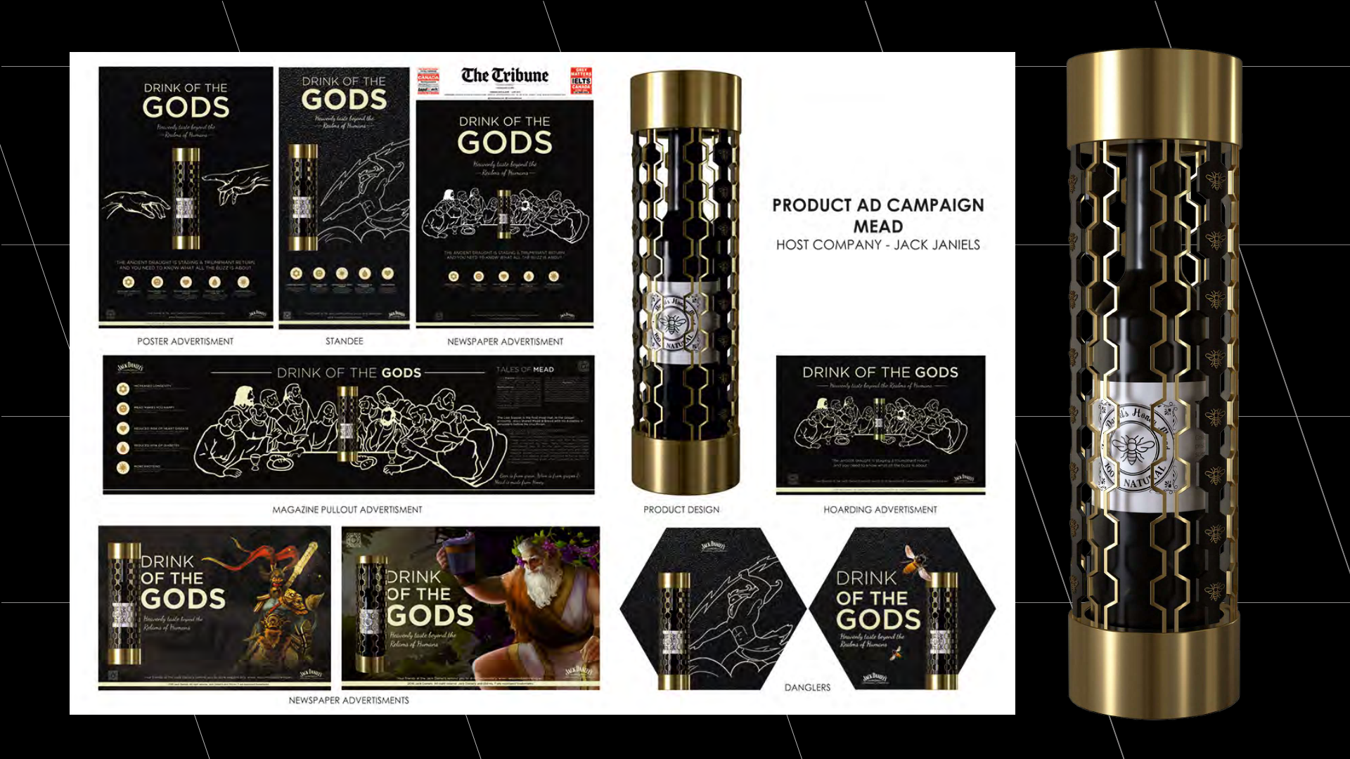
SaaS Products
Productised platforms, including MetaShot, the immersive cricket game.
Embedded Systems
Sensors and instrumented hardware that make installations respond to people.
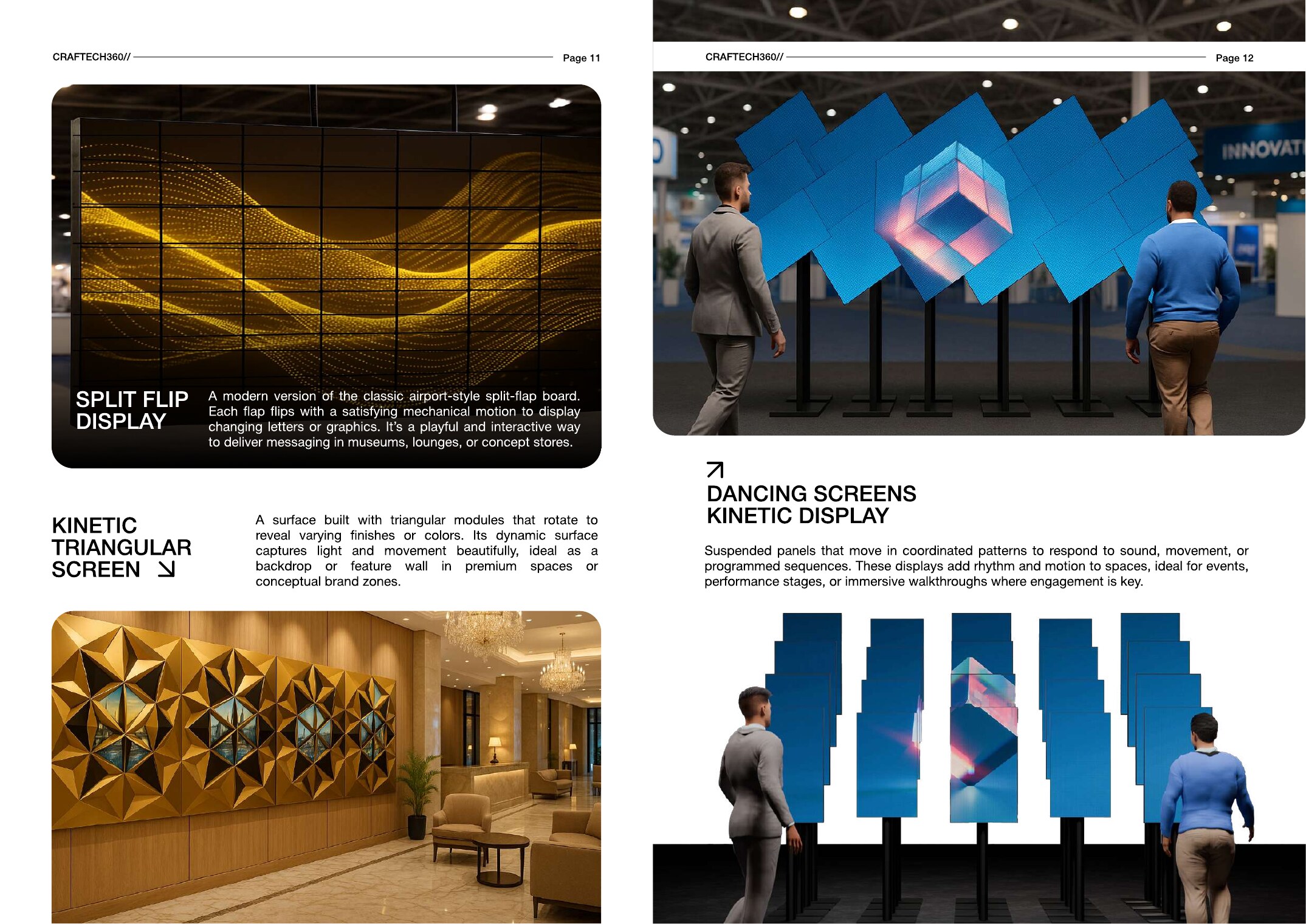
Kinetic Installations
Matrix screens, origami walls and 360° spherical LED that move with the room.
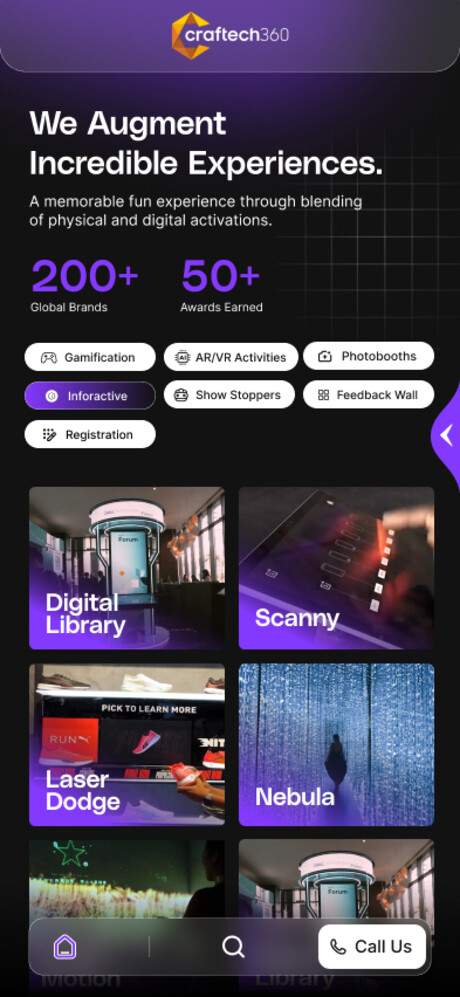
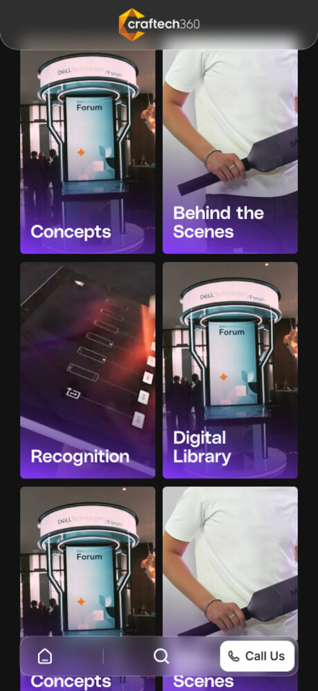
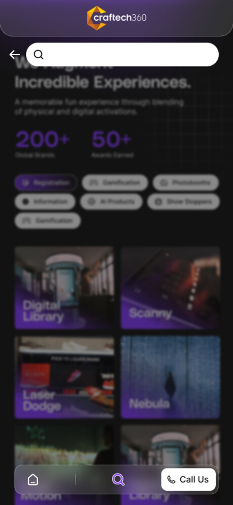
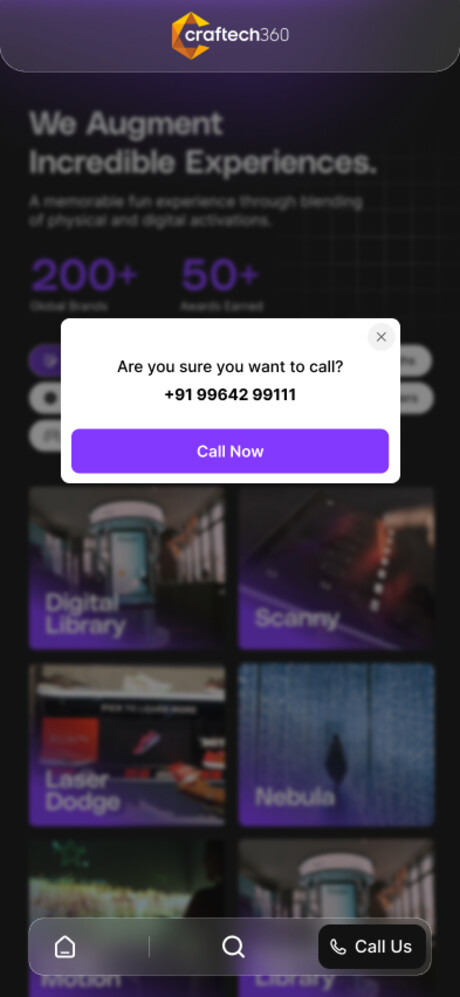
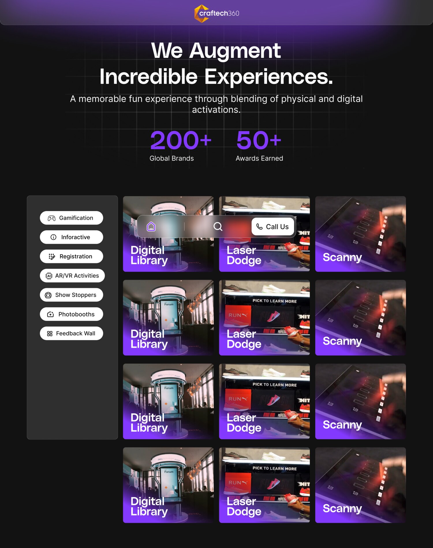
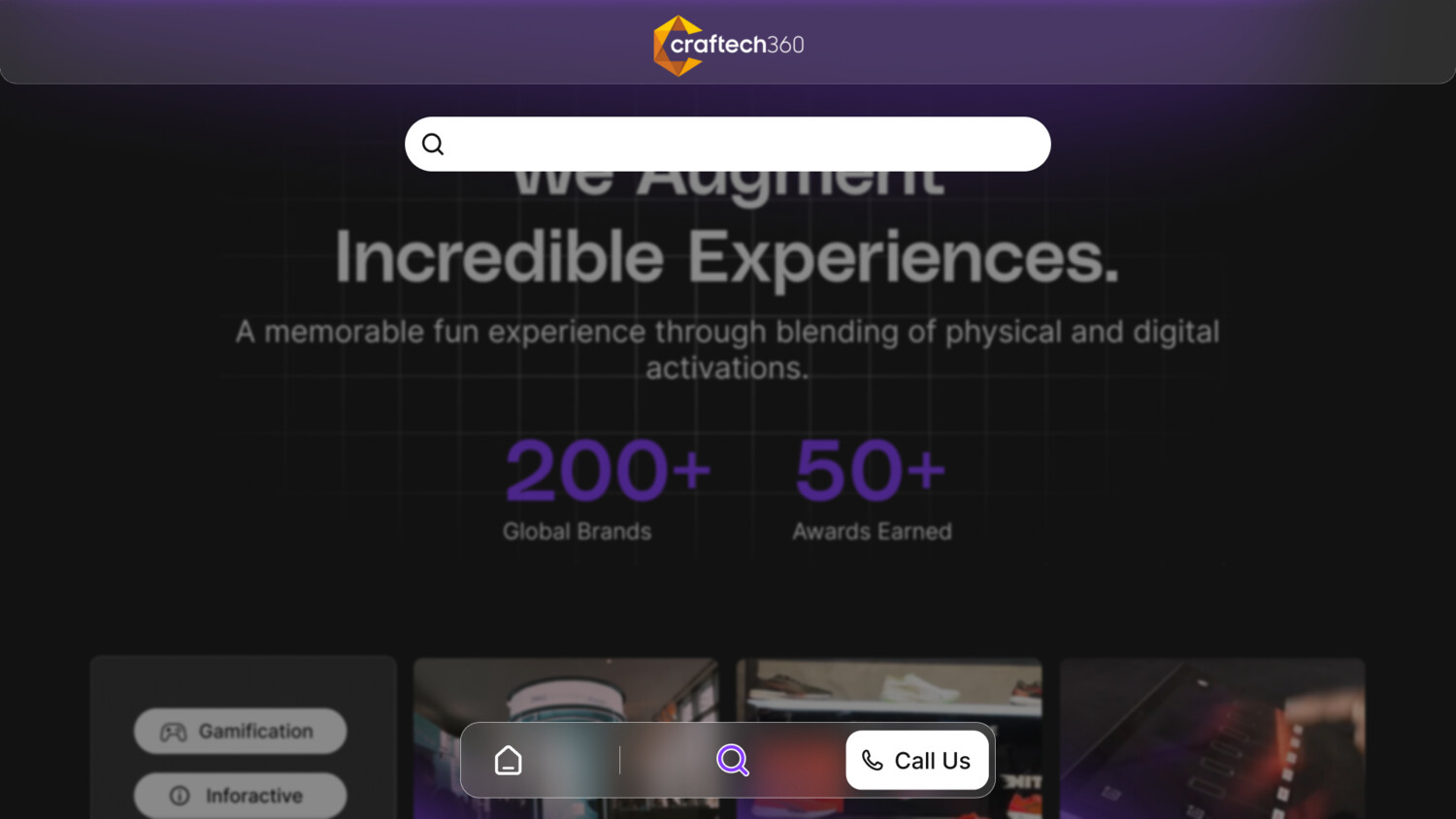
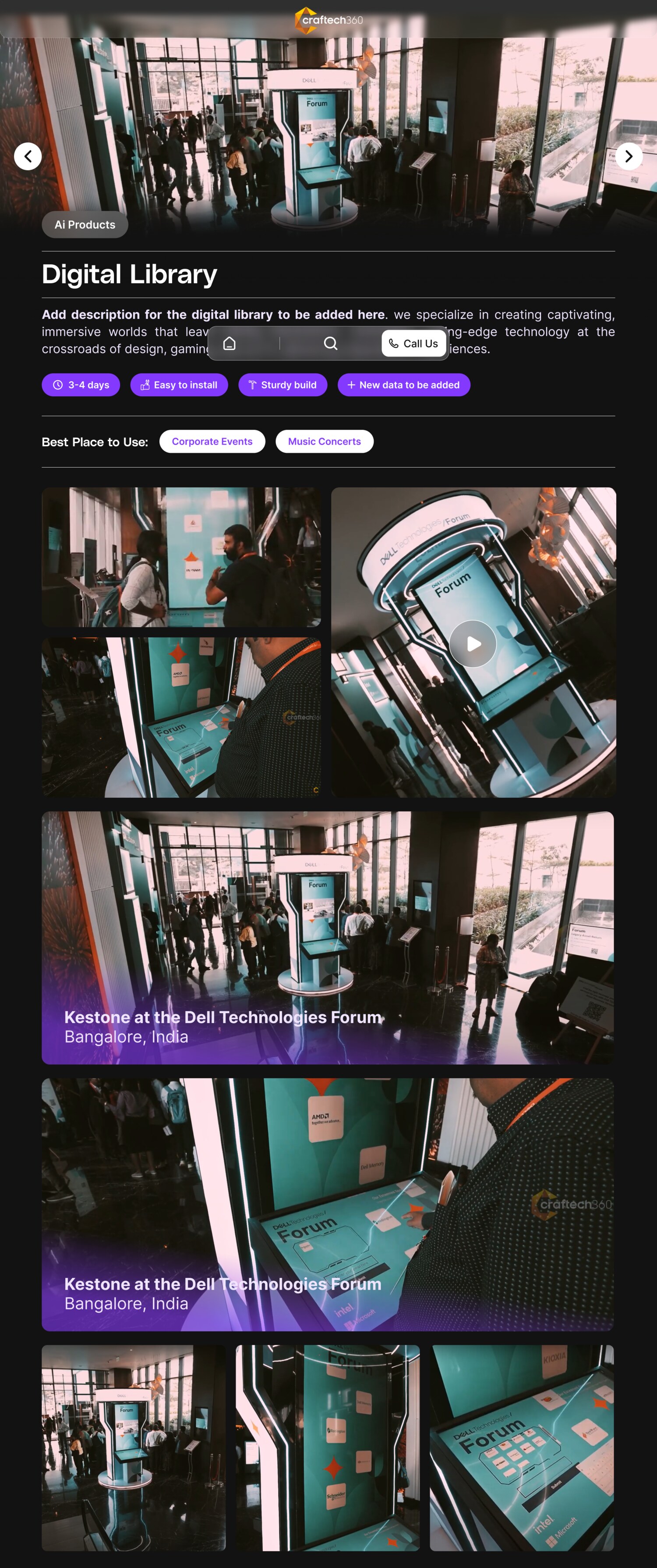
The Showcase App
"We Augment Incredible Experiences." A product catalogue that lets sales walk a client through 200+ live experiences from a phone or a screen on the booth wall.
Hundreds of experiences buried in folders and decks. Sales had no fast, on-brand way to show the portfolio in the room.
An immersive dark UI built on the system, with molten accents, faceted cards and big confident type, designed mobile-first and mirrored to desktop.
A single catalogue. Browse by category, dive into a product, view highlights and call the team. Consistent on every device.

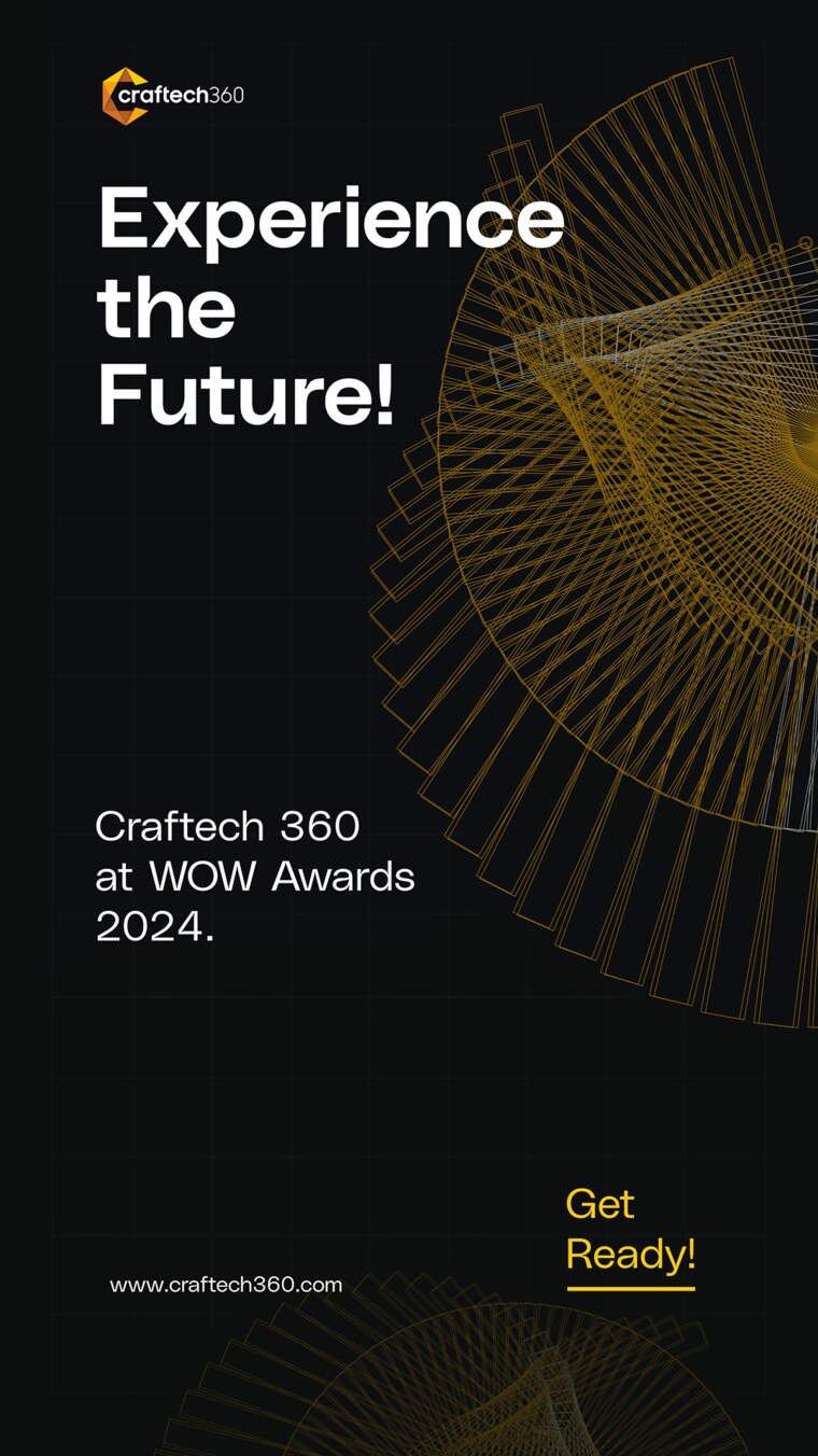
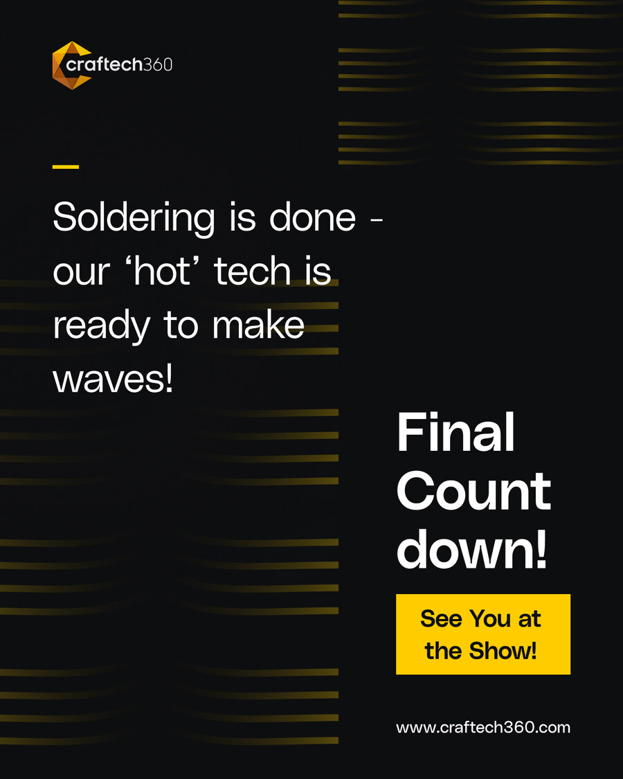
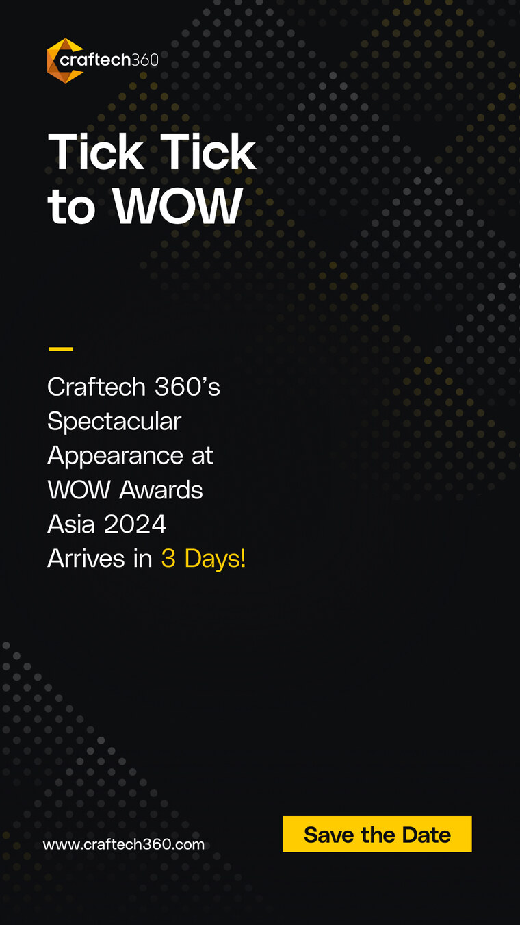
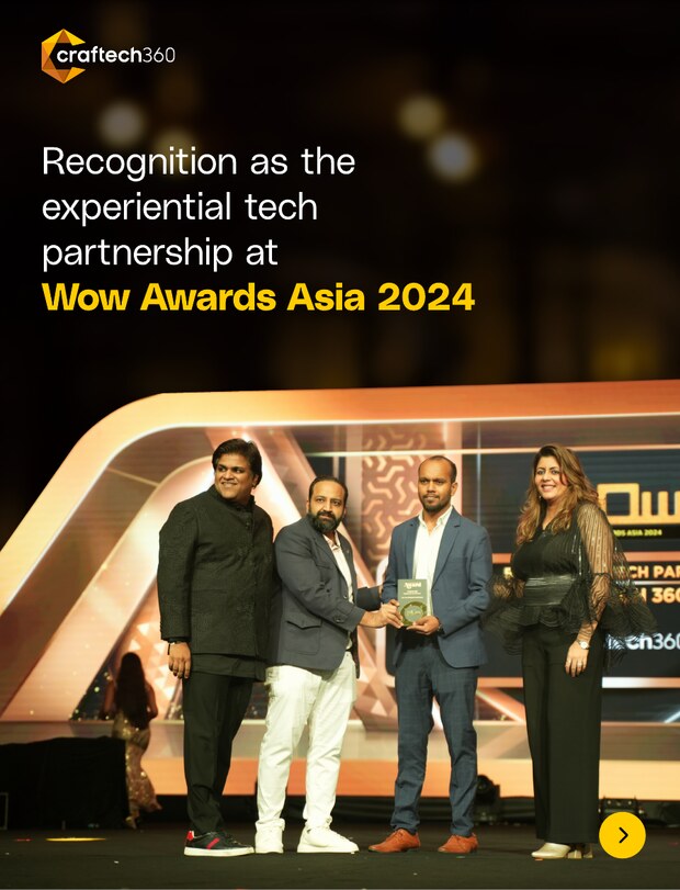
WOW Awards Asia
South Asia's biggest experiential and events industry platform. I ran Craftech360's presence across two editions, from the buildup campaign to the booth, the activation and the recap.
The buildup ran a bold, type-led countdown across channels under one promise: Experience the Future. The recap carousel documented the recognition, the Nebula installation at Jasmine Hall, and the Art of Immersion session at WOW Lab.
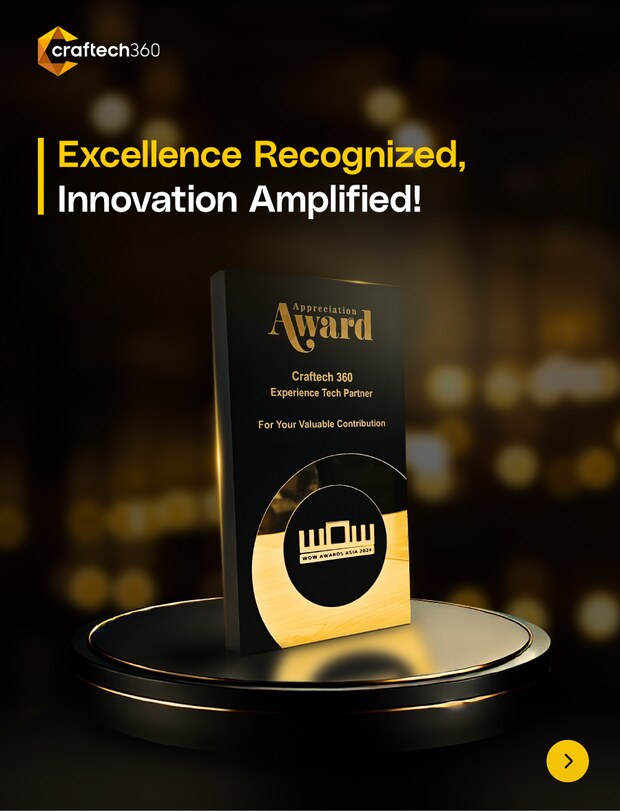
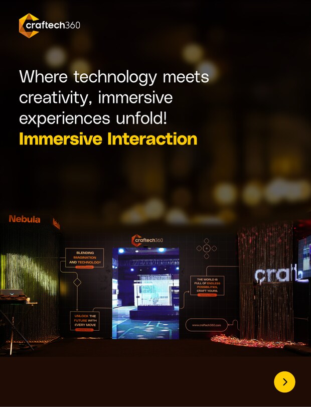
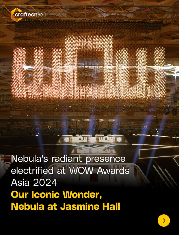
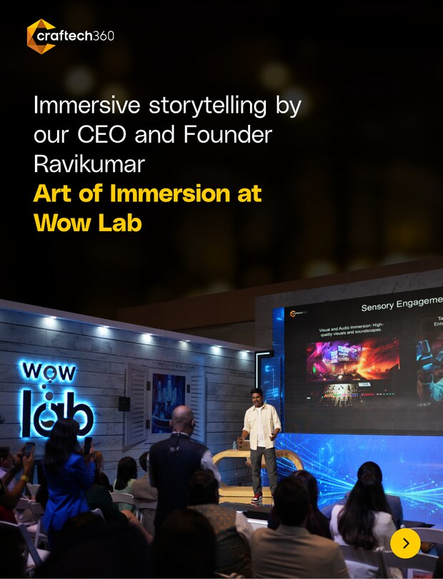
Recognition recap carousel · scroll through
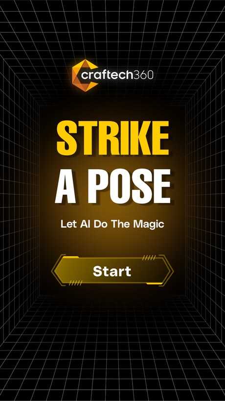
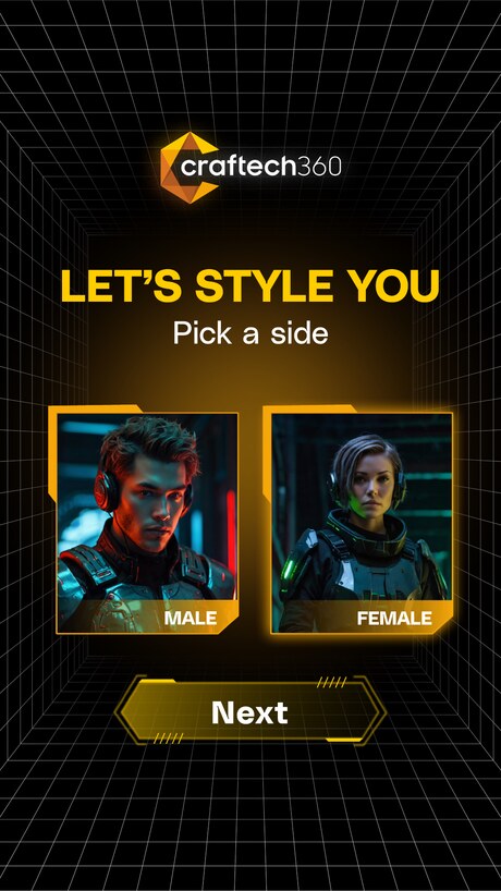
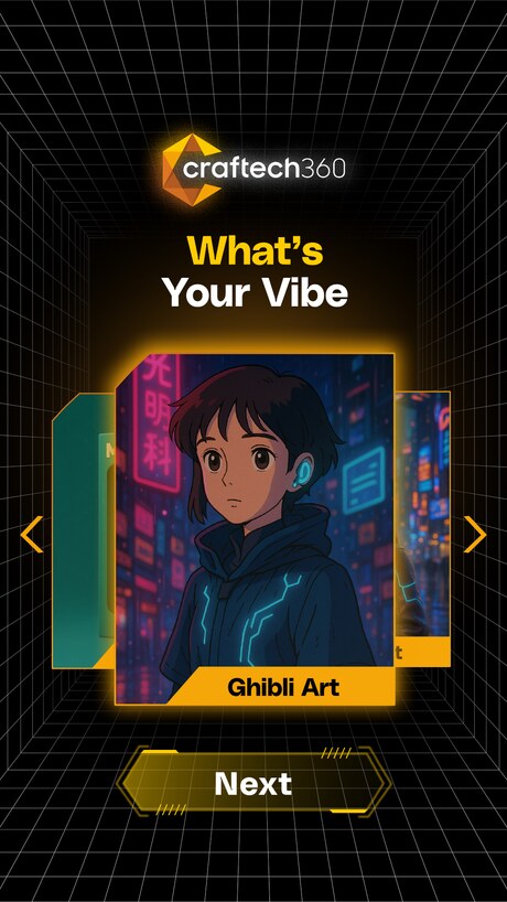
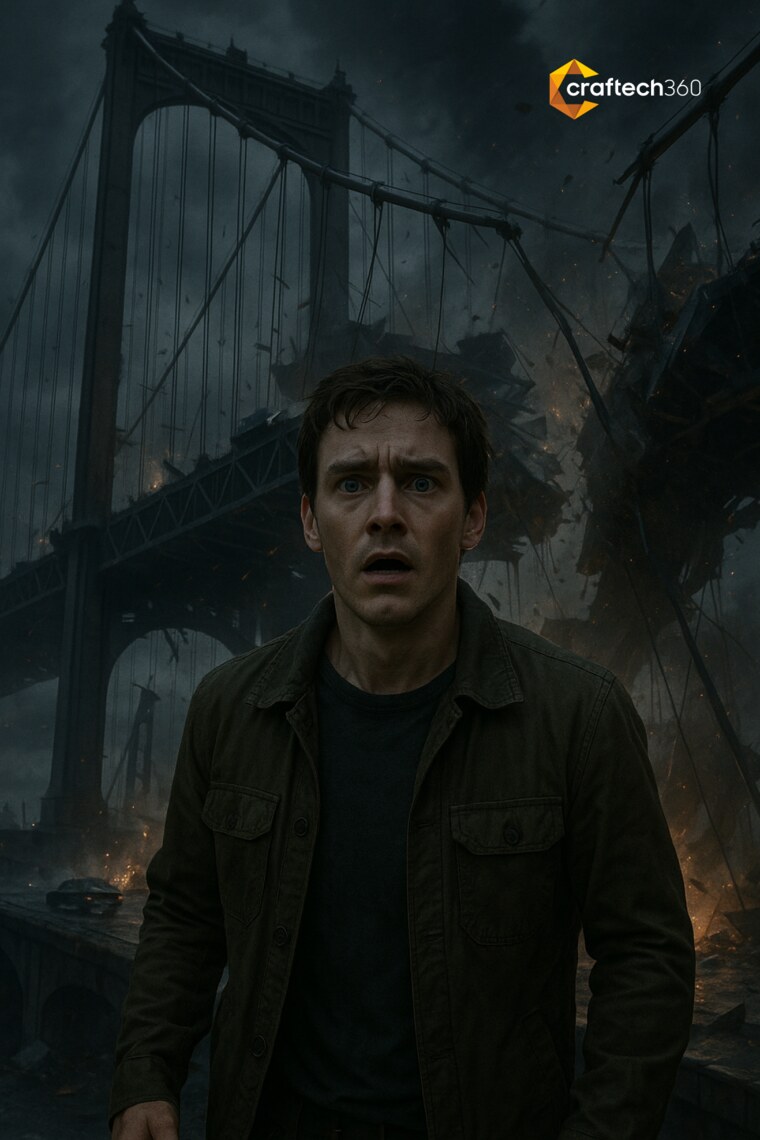
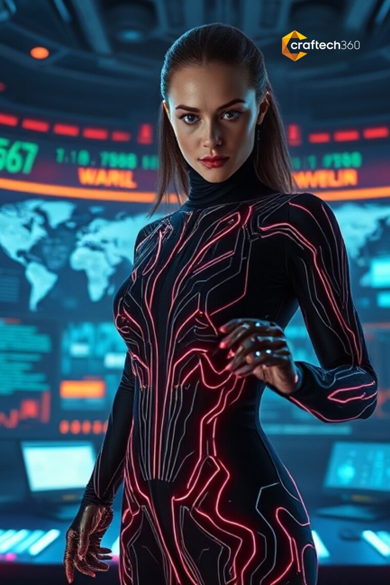
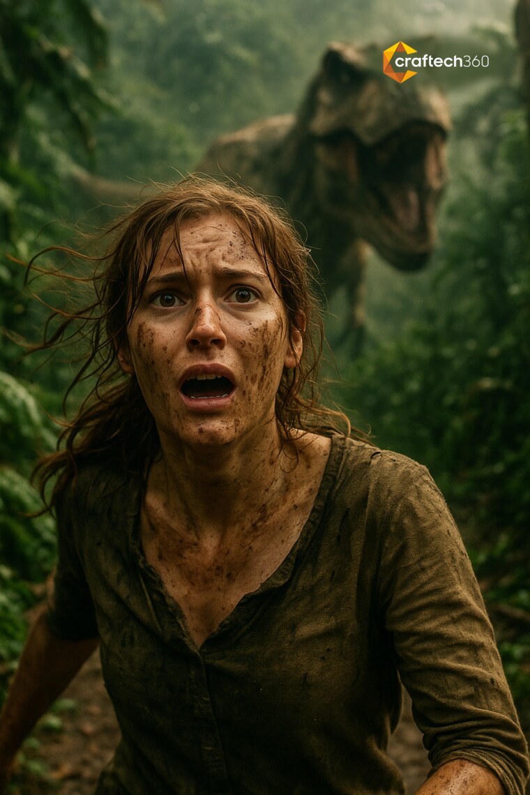
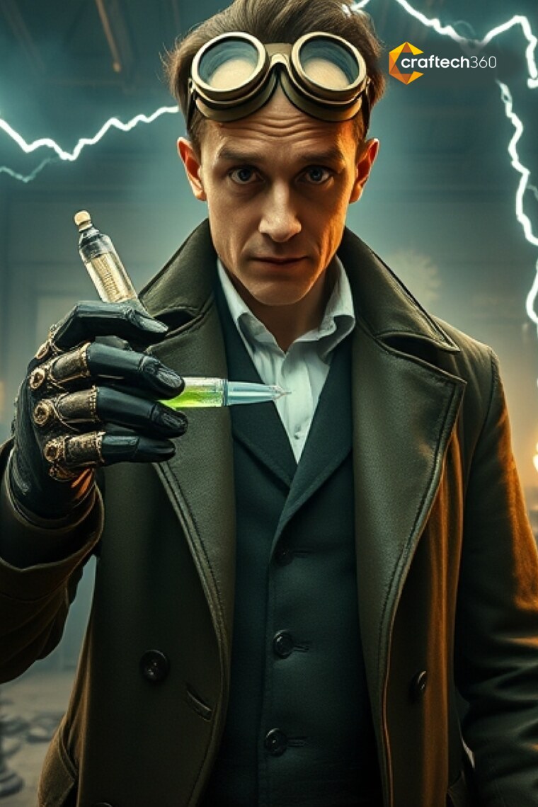
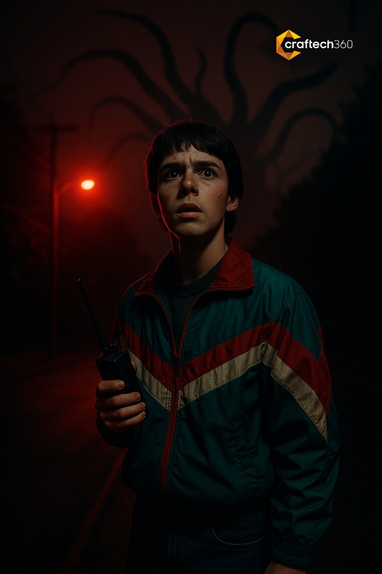
Strike a pose,
let AI do the magic
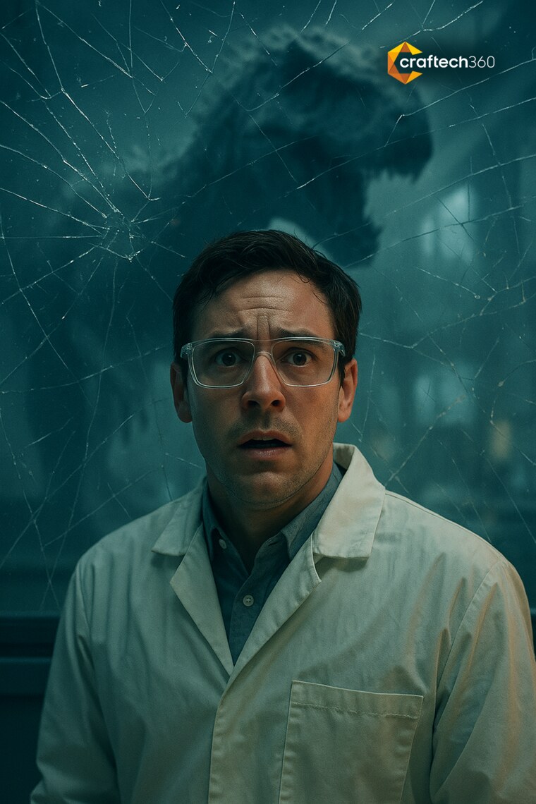
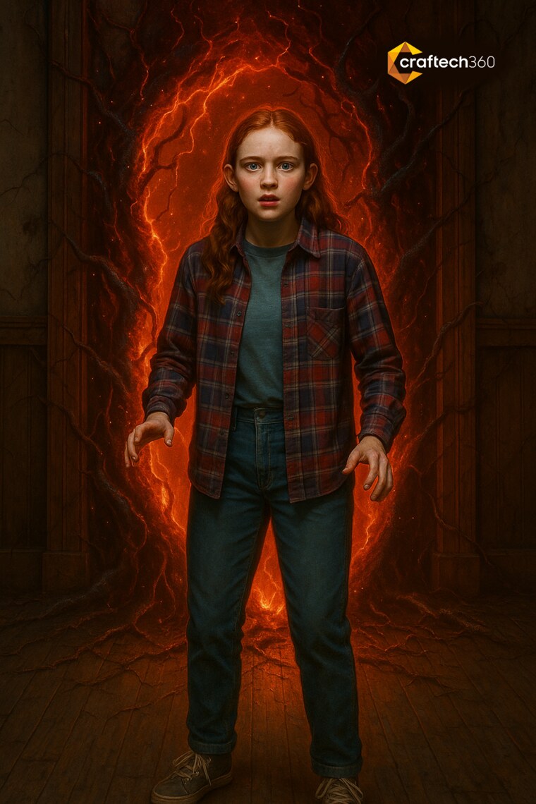
The centrepiece of the 2025 booth was an AI photobooth. Guests stepped through a guided flow, picked a cinematic style, struck a pose, and walked away as the hero of their own sci-fi or horror poster.
I art directed the full product, from the on-brand interface and copy to the prompt styling that produced the results. The booth graphics, the screen UI and the printed output all spoke one language.

Off the screen
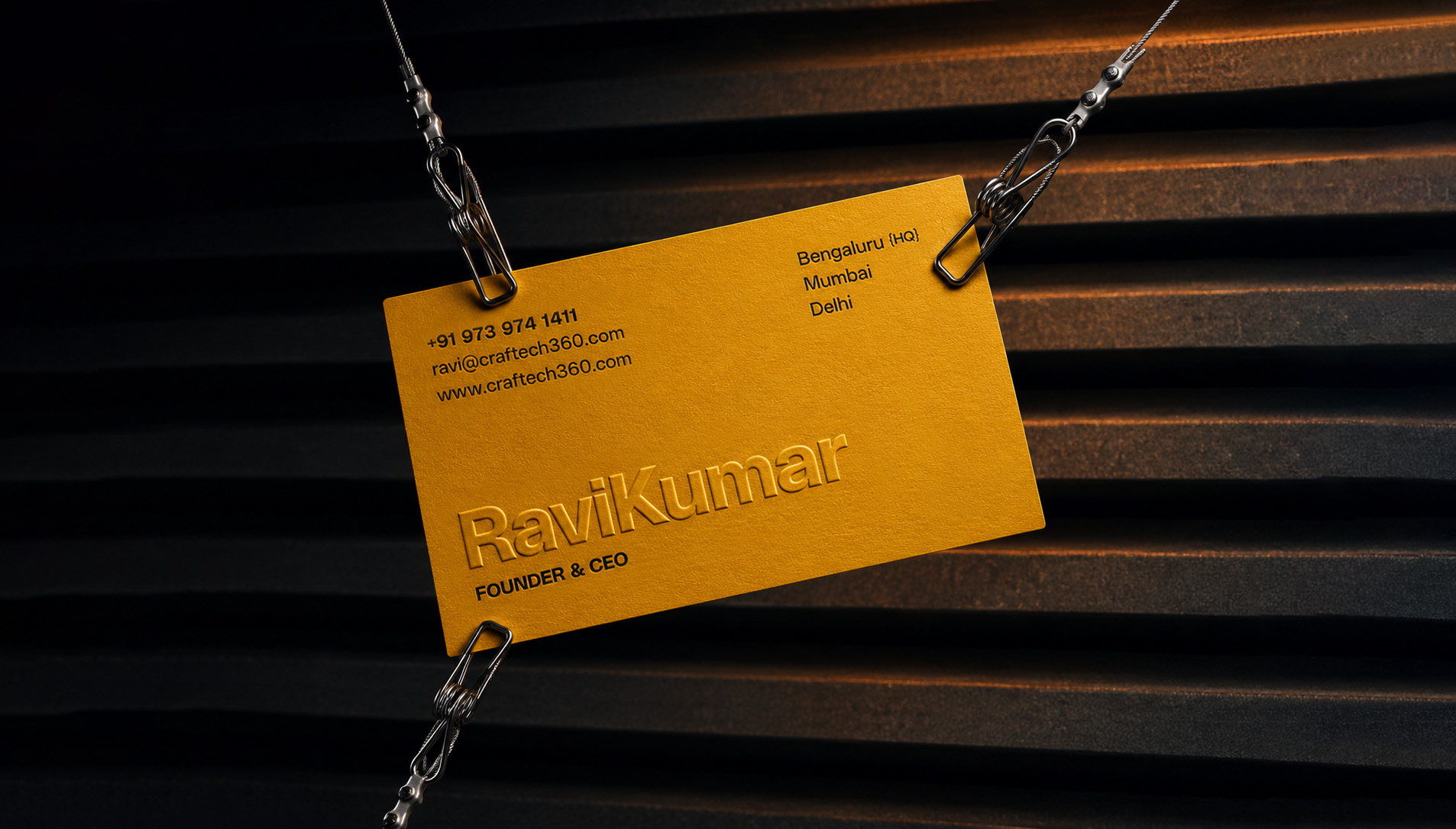
The system carried into the physical world: a 24-page company brochure, sales decks, stationery and event graphics.
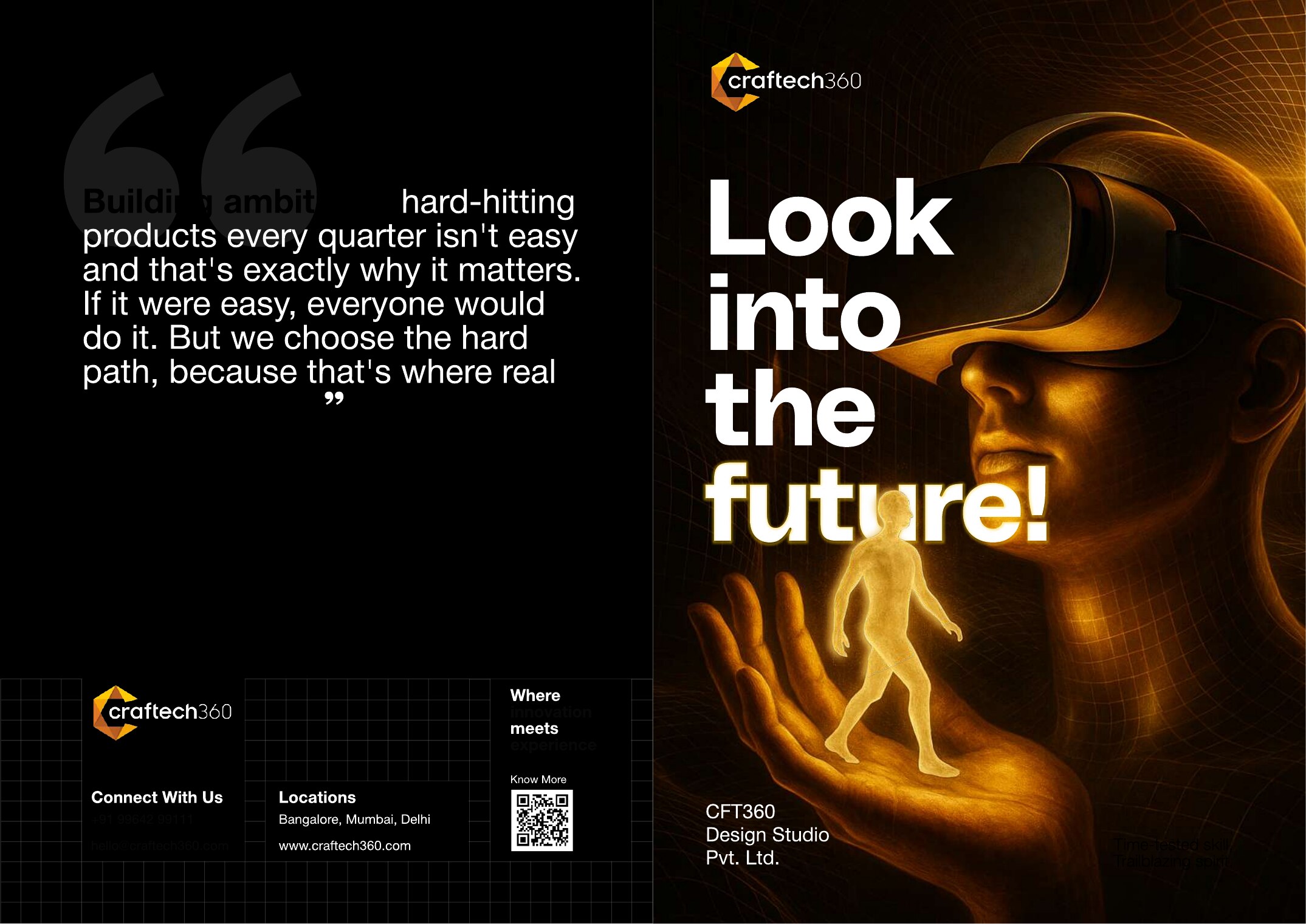
Look into
the future
A 24-page flagship brochure covering vision, journey, capabilities and the product portfolio, art directed cover to back in the brand system.
A3 spreads built on the grid, with the molten palette pacing the read and full-bleed installation photography doing the talking.

The payoff
One system, applied everywhere, so a fast-moving company finally looks as ambitious as the work it ships.
Brand guideline book, the single source of truth across the company.
The canted C drives logo, pattern, palette and motion. Total coherence.
Surfaces unified: product app, WOW Awards Asia, social, print and sales decks.
Enterprise brands met a consistent, confident Craftech360.
The Trade-offs
Dark brand direction over corporate light palette
Dark backgrounds communicated premium technology credibility, but required more careful print production. The brand equity gain outweighed the production overhead.
Custom wordmark over geometric logo
A pure icon would fail at small sizes on event materials. The wordmark gave flexibility across digital and physical, from app icons to 40-foot LED walls.
Fixed type hierarchy over flexible system
Giving teams a strict typographic hierarchy reduced creative freedom but increased brand consistency. The right trade for a 20-person team without dedicated design resources.
"The brand needed to live on a 40-foot LED wall and a 2-inch business card with the same authority."
— Abhinav Kaushal, on the design brief
Two truths,
earned in the room.
Brand guides are a form of creative direction.
The document tells every future designer what to do without you in the room.
Constraints make brands stronger.
A strict visual grammar made work recognisable across 14 simultaneous activations.
From a single angular letterform to a system that ships itself. Craftech360 now engages boldly and brands boldly, on every surface, in every room.
Always-on
social engine
A repeatable content system for the daily feed, from product carousels and hiring to workshops, milestones and festivals. All unmistakably Craftech360.
AI · AR/VR · Kinetic Installations · Immersive Events. Bengaluru, India.